Introduction
The website is here
- Bootstrap provides the framework or starting point for all sorts of different websites
- This is currently the world's most popular CSS framework. Leading competitors include Semantic, UIkit, Bulma, and Foundation.
- It gives us access to plenty of pre-built components, such as buttons and navbars.
- It also comes with a grid system, helping us contruct our own customized responsive layouts!
Incorporating Bootstrap
Method 1: Including Bootstrap via a Content Delivery Network (CDN)
The easy way to get started with Bootstrap is to access it remotely using a CDN. By using this method, you are linking to the Bootstrap CSS file hosted on a remote server, so you don't need to host the file on your own server.
To do so, always include the first of the following links in the HEAD of your document. If you want to include your own CSS stylesheet as well, always include it AFTERWARDS, so that Bootstrap doesn't override any of the properties included. I've called my CSS stylesheet bootstrapExample. Include these like so:
                        <link href="https://cdn.jsdelivr.net/npm/bootstrap@5.0.2/dist/css/bootstrap.min.css" rel="stylesheet" integrity="sha384-EVSTQN3/azprG1Anm3QDgpJLIm9Nao0Yz1ztcQTwFspd3yD65VohhpuuCOmLASjC" crossorigin="anonymous">
                        <link rel="stylesheet" href="../resources/bootstrapExample.css">
This is a good option if you don't want to host the files on your own server. Just remember to include the CSS file in the head of your HTML file. After that, you'll need to include theBootstrap JavaScript files in this way before the end of the closing body tag. The Popper.js library is a dependency of Bootstrap and is used to handle positioning and tooltips, so it should be included before the Bootstrap JavaScript file.
- <script src="https://cdn.jsdelivr.net/npm/@popperjs/core@2.9.2/dist/umd/popper.min.js" integrity="sha384-IQsoLXl5PILFhosVNubq5LC7Qb9DXgDA9i+tQ8Zj3iwWAwPtgFTxbJ8NT4GN1R8p" crossorigin="anonymous"></script>
- <script src="https://cdn.jsdelivr.net/npm/bootstrap@5.0.2/dist/js/bootstrap.min.js" integrity="sha384-cVKIPhGWiC2Al4u+LWgxfKTRIcfu0JTxR+EQDz/bgldoEyl4H0zUF0QKbrJ0EcQF" crossorigin="anonymous"></script>
Method 2: Including Bootstrap via download
The other way involves downloading the Bootstrap package from the official website and including the CSS and JavaScript files in your project. You can include the CSS file in the head of your HTML file, and the JavaScript file just before the closing body tag.
                            <link rel="stylesheet" href="path/to/bootstrap.min.css">
                            <--This link goes in the head-->

                            <script src="path/to/bootstrap.min.js"></script>
                            <--This link comes in before the closing <body> tag
However, it's good practice to use a Content Delivery Network (CDN) to include the
Bootstrap files in
your website. This allows your website to load the files from a server that is geographically closer to the
user, which can improve the website's loading time.
Using Classes From Bootstrap's Stylesheet
A container is the most basic layout system, and required to use Bootstrap's
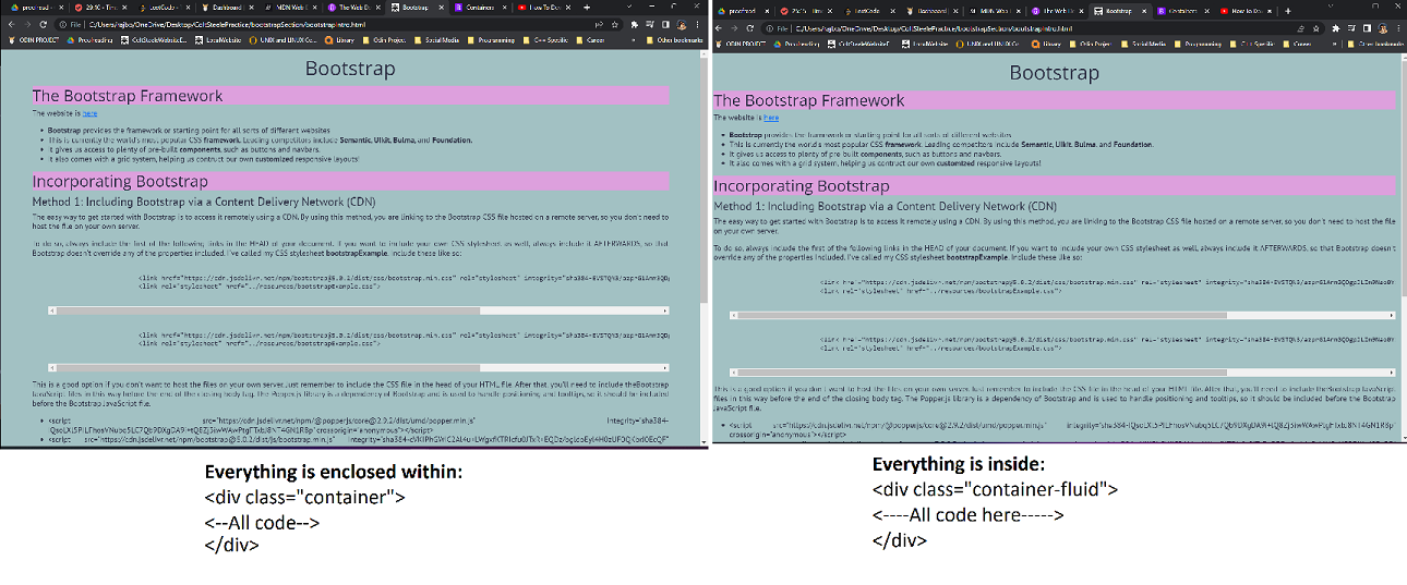
There are three main types of container (created quickly in VS Studio Code using a class name, such as .container and hitting TAB), including:
- The standard .container
- A fluid container like .container-fluid
- Responsive containers, such as .container-sm, .container-md, .container-lg, and .container-xl
The standard container simply enclosed the content of our <body> in a class that imposes margins and padding. The fluid container class is used for a full-width container spanning the length of the viewport. The responsive containers keep the screen at full-width until a specific breakpoint is reached.
Buttons in Bootstrap
Buttons, as with many features in Bootstrap, need to make use of classes. Whether it's a button or a navbar, be ready to consult the documentation often! In general, it's easier to consult the documentation than to attempt to memorize the order of something like btn-outline-warning etc...
Semantic Buttons
The typical button styles can be found here
It's fairly easy to include them...compare the following two button types: the former using Bootstrap, the latter nothing:
- : made using <button type="button" class="btn btn-primary">
- : utilizes the button tag <button> alone!
Different styles of button
Buttons can come in an array of different styles and sizes. For example, the outline is semantic, and included to create buttons without background images/colors. class="btn btn-outline-primary":
It's also very common to see semantic terms representing size, such as sm, md, and lg. e.g. from class="btn btn-primary btn-lg" down:
Adding the disabled state to a button
Adding the disabled attribute to a button makes the button look unsaturated and disabled: class="btn btn-lg btn-primary" disabled:
Typography and Utilities
Typography is found here
Display Class
- Used to make large headers (a display heading). Indeed, the heading of this page uses: <h1 class="display-1">Bootstrap</h1>
- I did the same with the <h4> for the heading immediately above too! The easiest way to do this quickly is to type in "h4", add .display-1, and then hit TAB. You'll now have a h4 tag with the class display-4.
- Using Bootstrap's "display" classes, such as "display-1", "display-2", etc., with your headers can be a good way to create consistent, visually appealing typography throughout your website. These classes are designed to provide a set of predefined font sizes and weights that can be easily applied to headings.
- It's best practice to use them when you want to create a consistent typography, or when you want to make your headings stand out more prominently. If you want to create different typography styles for different sections of your website, you can use these classes selectively.
- However, keep in mind that using too many different font sizes and styles can make your website look cluttered and difficult to read. It's important to use a consistent typography and to use different font sizes and styles sparingly and with purpose.
Lead Class
- The lead class, as use here will make this <li> block look more prominent than the otherwise identical block that follows.
- Can you see the difference? It's honestly best to stick to <p class="lead"> or <div class="lead">
Blockquotes
This element represents a quotation that is offset in its own line. Using <blockquote> is an easy way to do this, and this section in the documentation is really helpful with that!
Alignment of text
Text is relatively easy to align using classes such as .text-end, or
text-center. We'll use text-center below:
Here is where some more detailed
text components can be changed!
Basic Utilties
Finally, other basic utilities will be covered next! Here are some helpful ways to adjust text color and background-color
Badges, Alerts, and Button Groups
Badges
                    <button type="button" class="btn btn-primary">
                        Updates <span class="badge bg-secondary">4</span>
                    </button>
The button group component just melds multiple buttons into a group
Alerts
Oh No!
My queen!
                        <div class="alert alert-danger">
                            <h4 class="alter-heading">Oh No!</h4>
                            My queen!
                        </div>
Don't Dismiss This
Can you...
... make me disappear?
                        <div class="alert alert-warning alert-dismissible fade show" role="alert">
                            <h4 class="alert-heading">Can you...</h4>
                            ... make me disappear?
                            <button type="button" class="btn-close" aria-label="Close" data-bs-dismiss="alert">
                                <span aria-hidden="true">×</span>
                            </button>
                        </div>