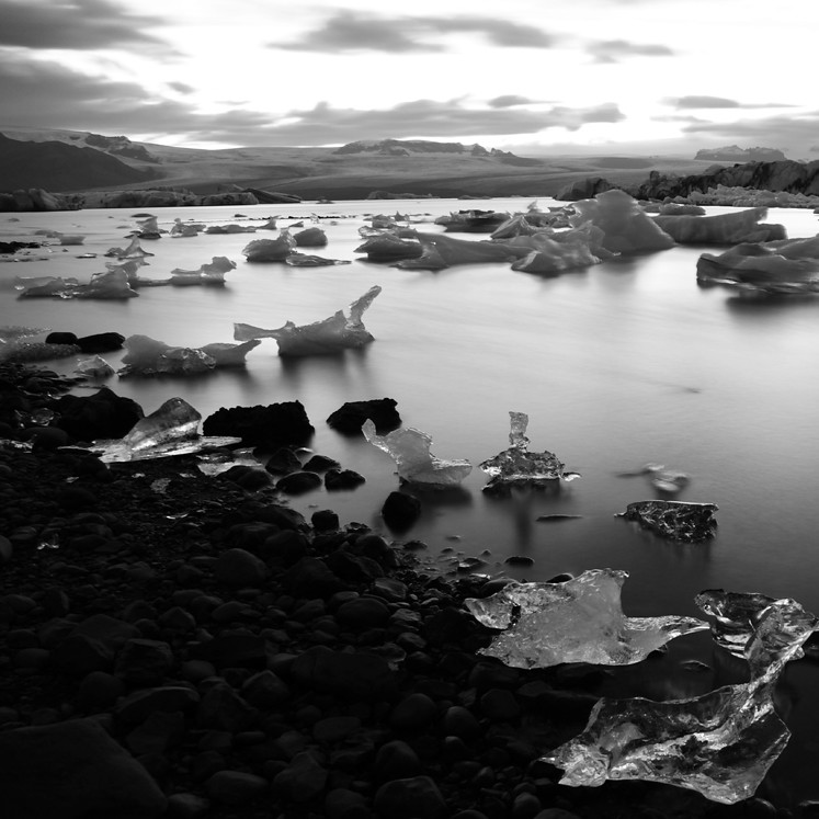
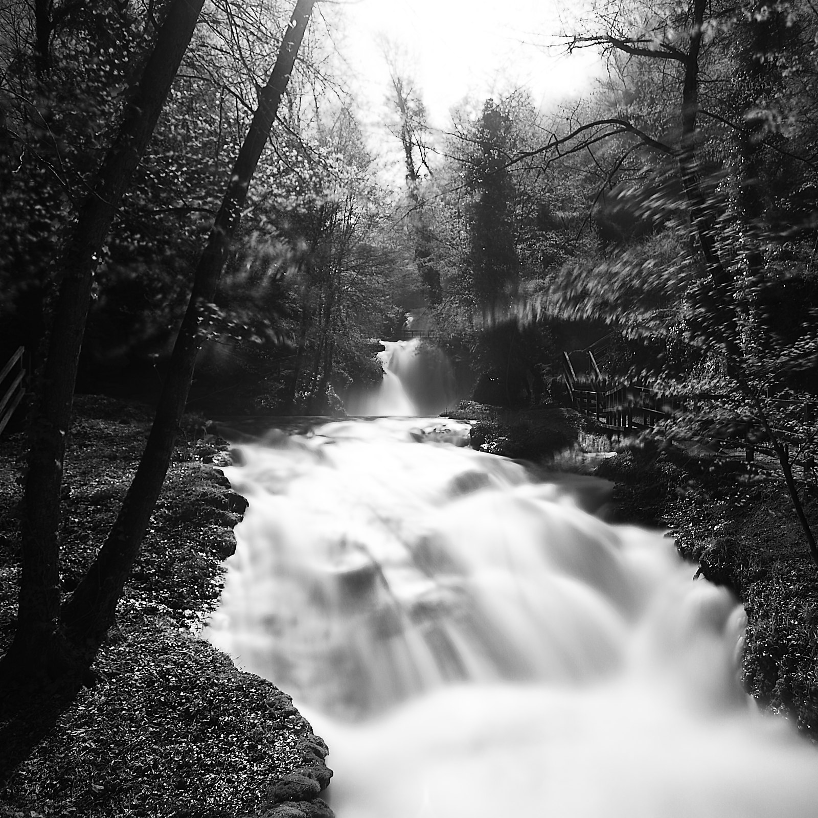
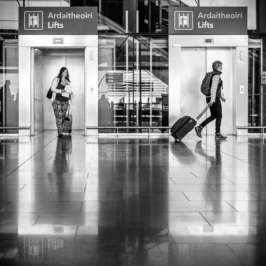
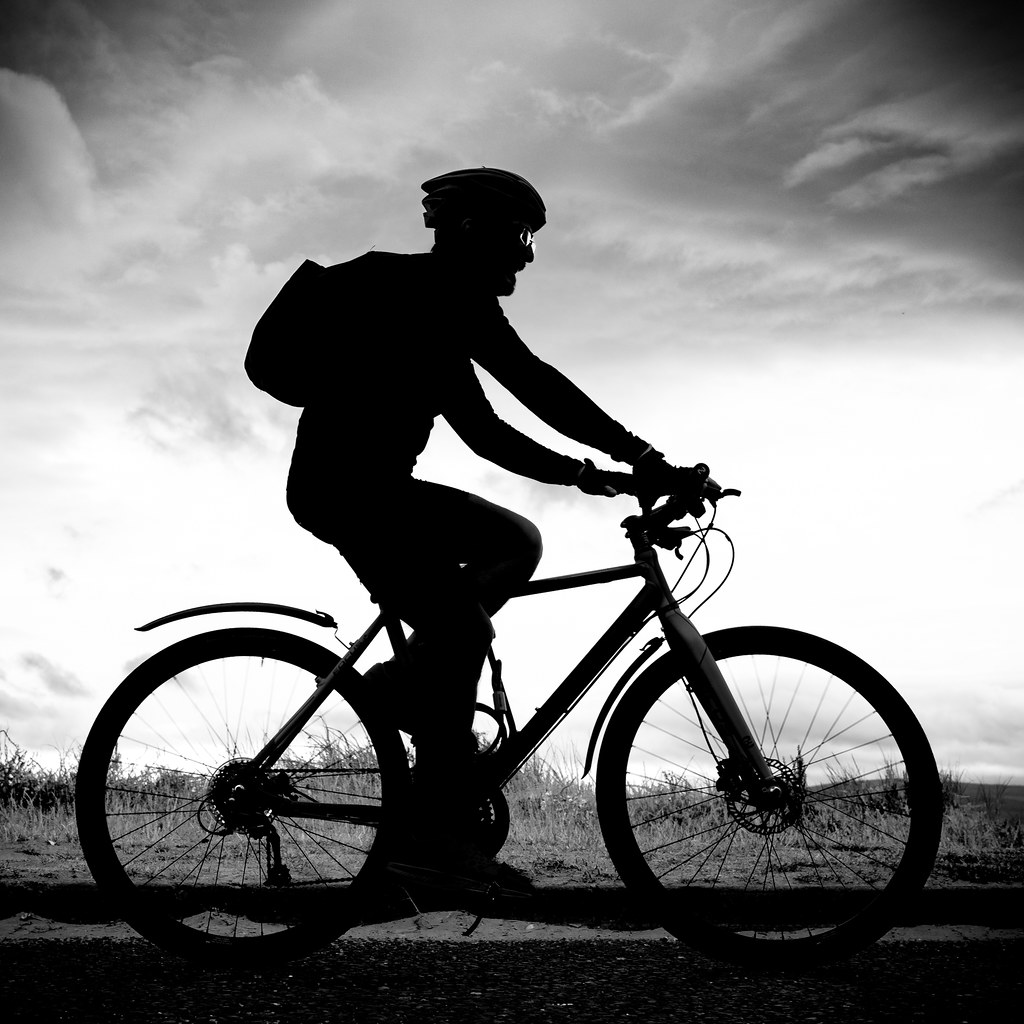
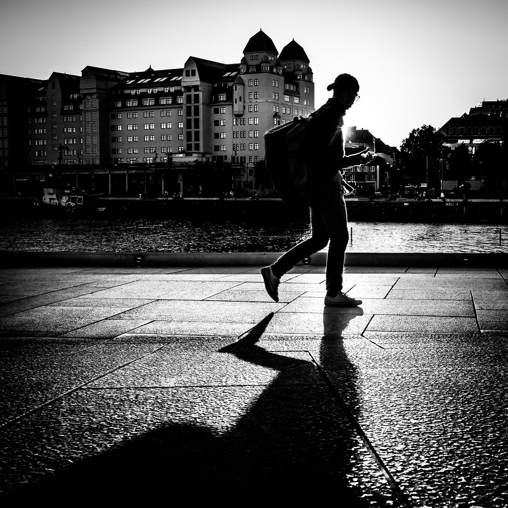
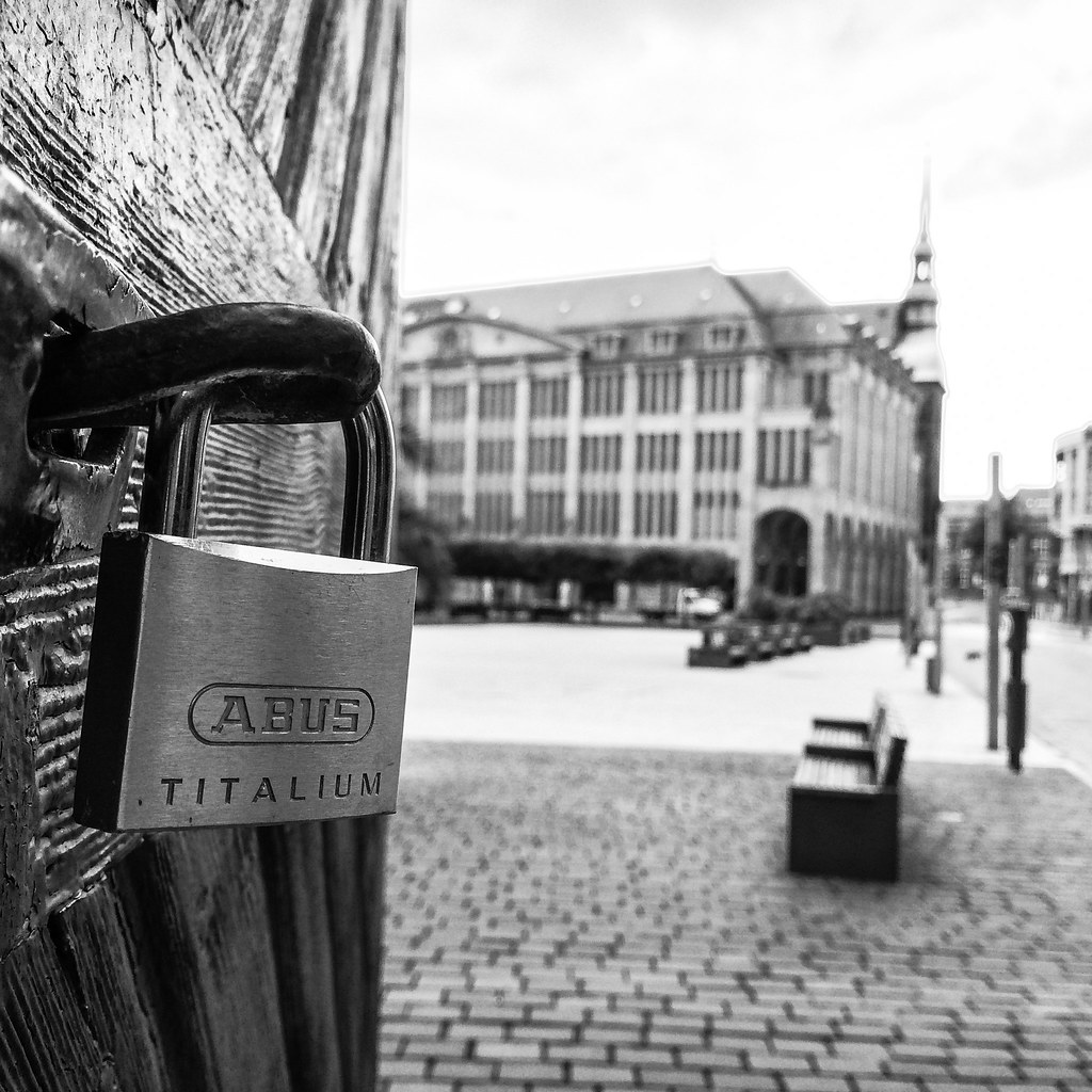
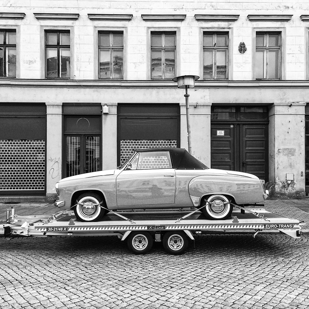
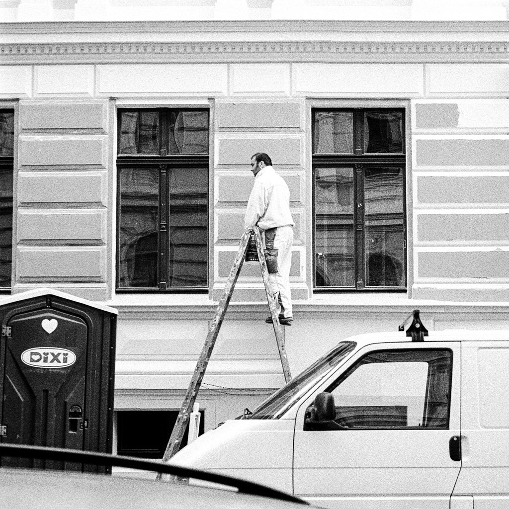
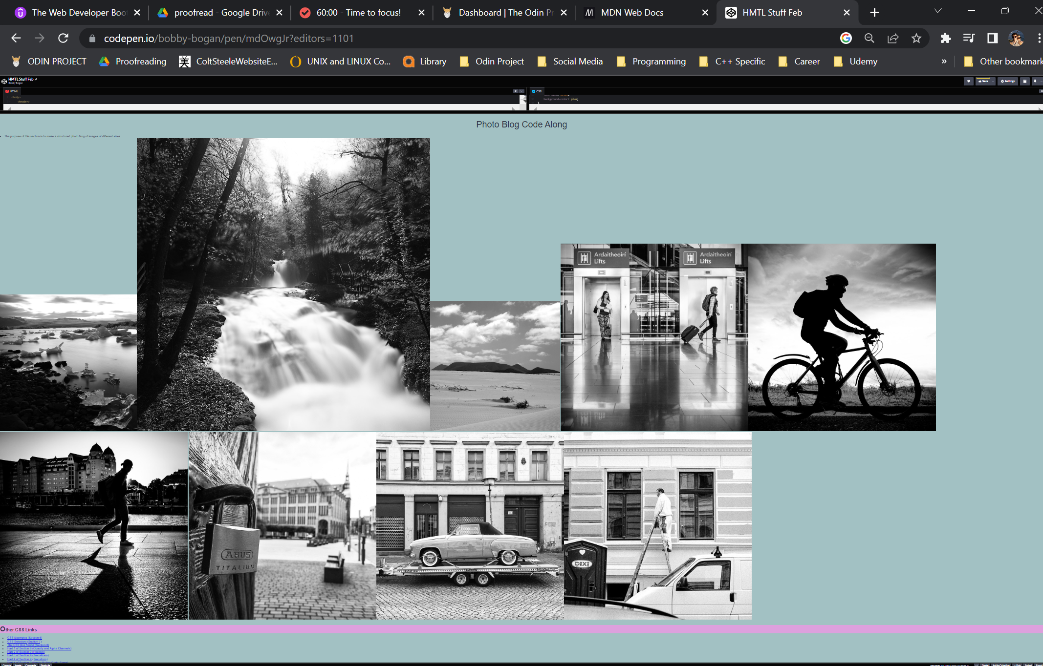
The purpose of this section is to make a structured photo blog of images of different sizes. For
simplicity,
my width in the body is different from other areas of the site. One thing to note is the way images are
laid
out in the page! HTML has real issues with whitespace - place your images next to each other, until you
master FlexBox! Unlike in the
lecture, I had some initial CSS code:
                    ::selection {
                        color: gold;
                        background-color: red;
                    }

                    h3::first-letter {
                        font-size: 1.6em;
                    }

                    h1,
                    h2,
                    h3 {
                        font-family: 'Open Sans', sans-serif;
                        margin-bottom: 0.5em;
                    }

                    h1 {
                        font-size: 3rem;
                        font-weight: 100;
                        text-align: center;
                    }

                    h3 {
                        font-size: 1.5em;
                        background-color: plum;
                    }

                    body {
                        line-height: 1.2;
                        background-color: #A2C1C3;
                        color: #2b2d42;
                        font-family: 'PT Sans', sans-serif;
                        margin: 0 auto;
                    }
We want to add more code to get from the rough layout shown here to a the more structured layout on the
right. Note that I'll be using descendent selectors for the <img> tags - the
images
are inside a
<section>
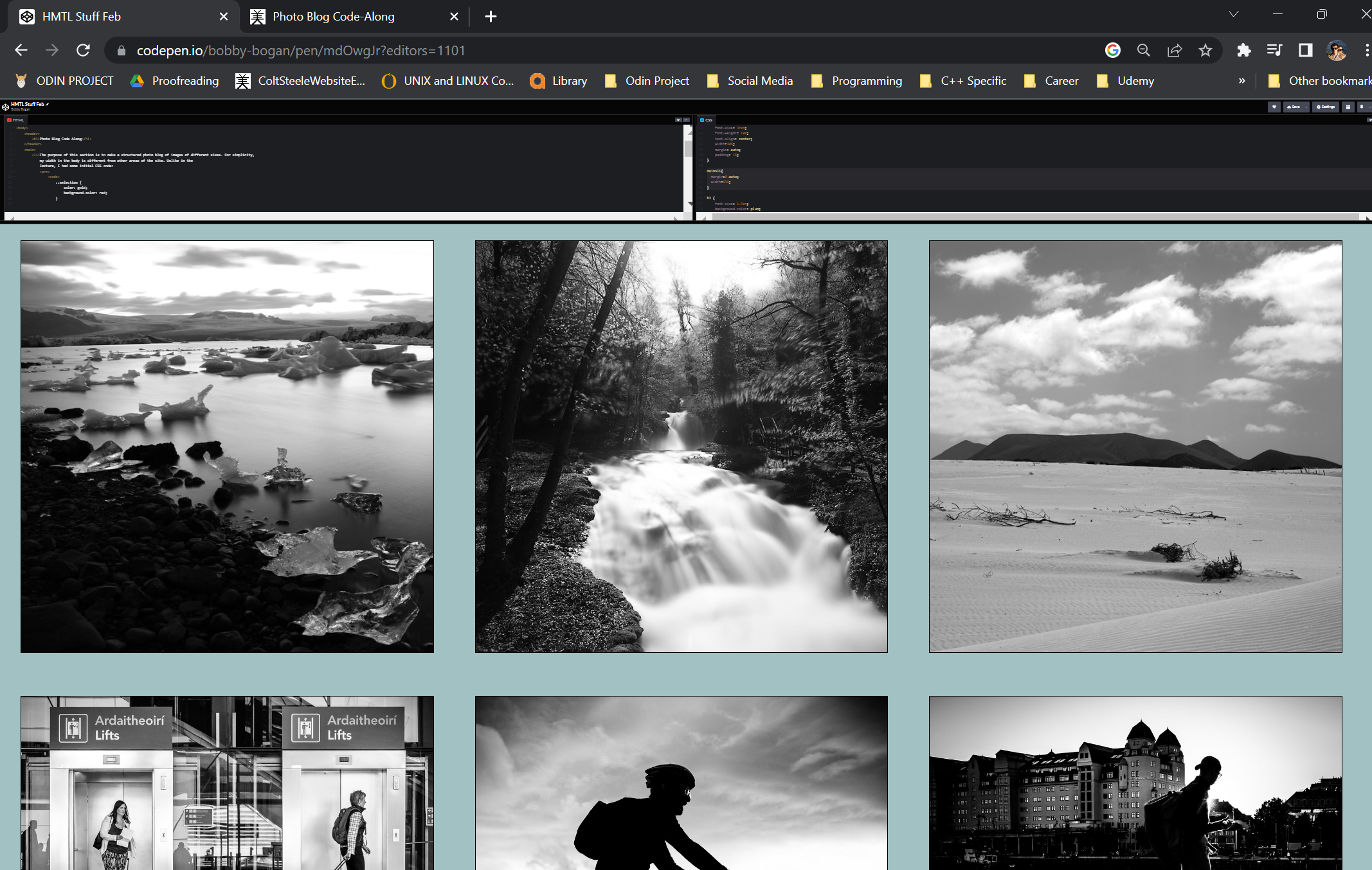 Using this simple code results in a much more structured layout!
                    section>img{
                        width:30%;
                      }
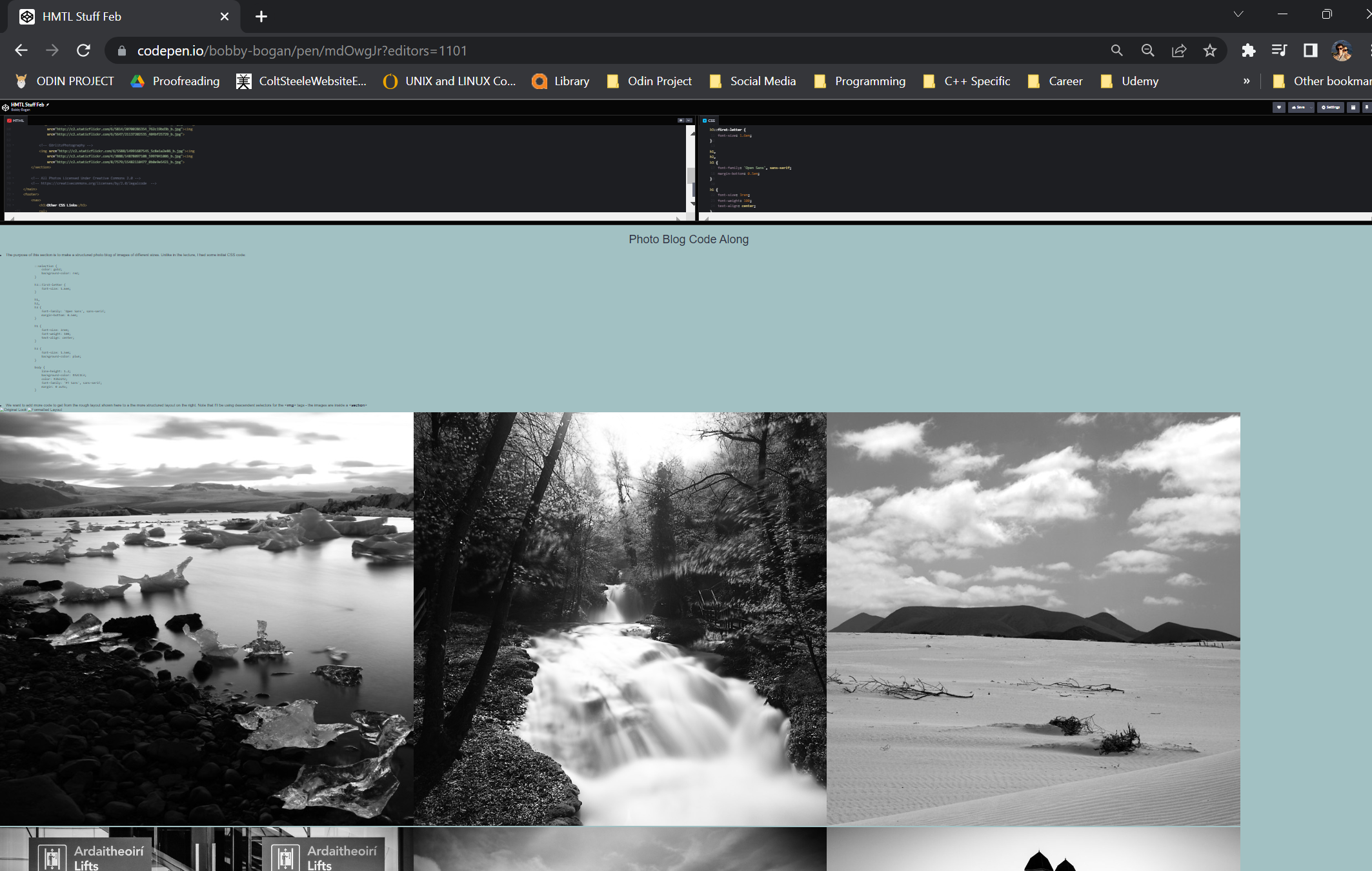 However, the above is not ideal! We have about 10% on the right-hand side. Hard-coding in some absolute
value, such as "margin:20px;" is a bad idea! It doesn't scale very well. Instead, we make use of a
calculation function to divide our 10% remainder. Because margin is located on the left AND right of an
individual element, we need to calculate a percentage of 10/6 to get the desired 3*3
grid
of equally-sized
photos. There are multiple advantages to this approach: the images shrink in sync with the screen size.
Rather than use 1.66666666%, we can pass in our values using calc(). See below:
However, the above is not ideal! We have about 10% on the right-hand side. Hard-coding in some absolute
value, such as "margin:20px;" is a bad idea! It doesn't scale very well. Instead, we make use of a
calculation function to divide our 10% remainder. Because margin is located on the left AND right of an
individual element, we need to calculate a percentage of 10/6 to get the desired 3*3
grid
of equally-sized
photos. There are multiple advantages to this approach: the images shrink in sync with the screen size.
Rather than use 1.66666666%, we can pass in our values using calc(). See below:
                section>img{
                    width:30%;
                    margin:calc(10%/6);
                  }
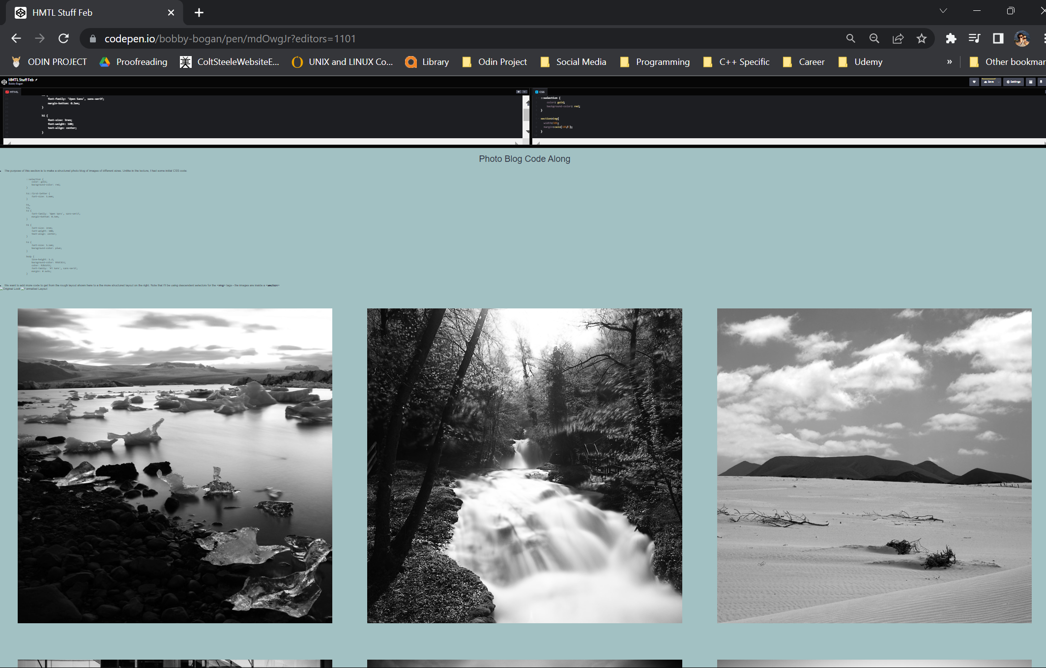 As an aside, some classes are attached to the images above too.
                    .center{
                        display: block;
                        margin:auto;
                        width: 80%;
                    }

                    .example{
                        width:45%;
                        margin:calc(10%/4);
                    }
A few other rudimentary changes were made to improve the formatting of the text as well:
                    h1 {
                        font-size: 3rem;
                        font-weight: 100;
                        text-align: center;
                        width:30%;
                        margin: auto;
                        padding: 1%;
                    }

                    main>li{
                        margin:0 auto;
                        width:65%;
                      }


                    img{
                        border:2px solid black;
                    }
Finally, we got the desired look: