display:flex;
The first thing that is done is to enter the container ID within css, and change the display to flex. This creates a so-called flex container.
                #container {
                    background-color: #003049;
                    width: 90%;
                    height: 500px;
                    margin: 0 auto;
                    border: 5px solid #003049;
                    display:flex;
                }
flex-direction
In the Flex model, we have a main-axis which initially goes from left to right, and a cross axis which intially goes from top to bottom.
The flex-direction property determines the direction in which the flex items are laid out within a flex container. By default, flex items are laid out in a row from left to right.
However, you can use flex-direction to change the direction to a column from top to bottom, or to make rows that are reversed from right to left or bottom to top.
Essentially, flex-direction sets the direction in which flex items are laid out along the main axis.
Advantages of using flex-direction
- It allows you to easily control the layout of items within a container in a flexible and responsive way.
- It allows you to easily align items along a main axis (horizontally or vertically) and a cross axis (perpendicular to the main axis).
- It simplifies the process of creating layouts that work on different screen sizes and devices.
Changing the Flex Model
- To use the flex-direction property, you can add it to
your
CSS code like so:
                        #container {
                            display: flex;
                            flex-direction: row;
                            /* default value */
                            }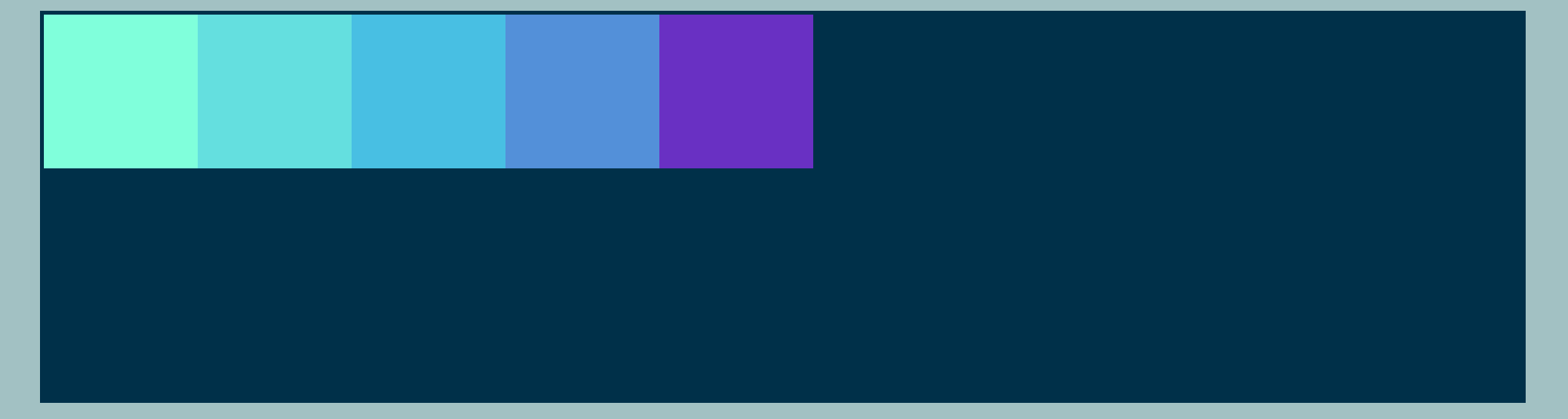
flex-direction: row; essentially, this lays out items from left to right. - We can adjust the code in 3 other ways:
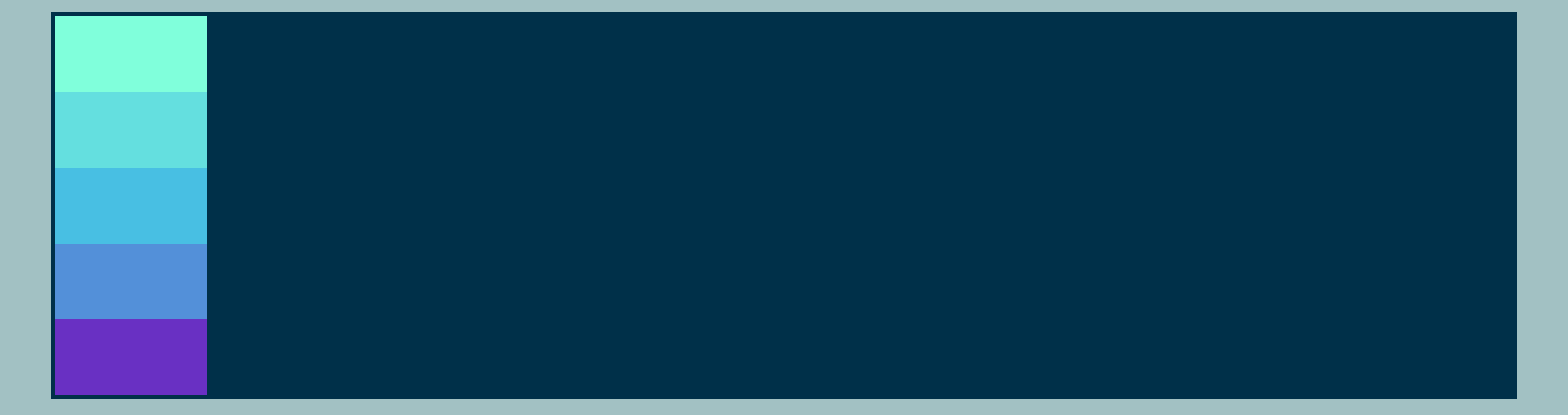
flex-direction: column; this arranges our divs from top to bottom. #container { display: flex; flex-direction: column; /* change direction to a column from top to bottom */ }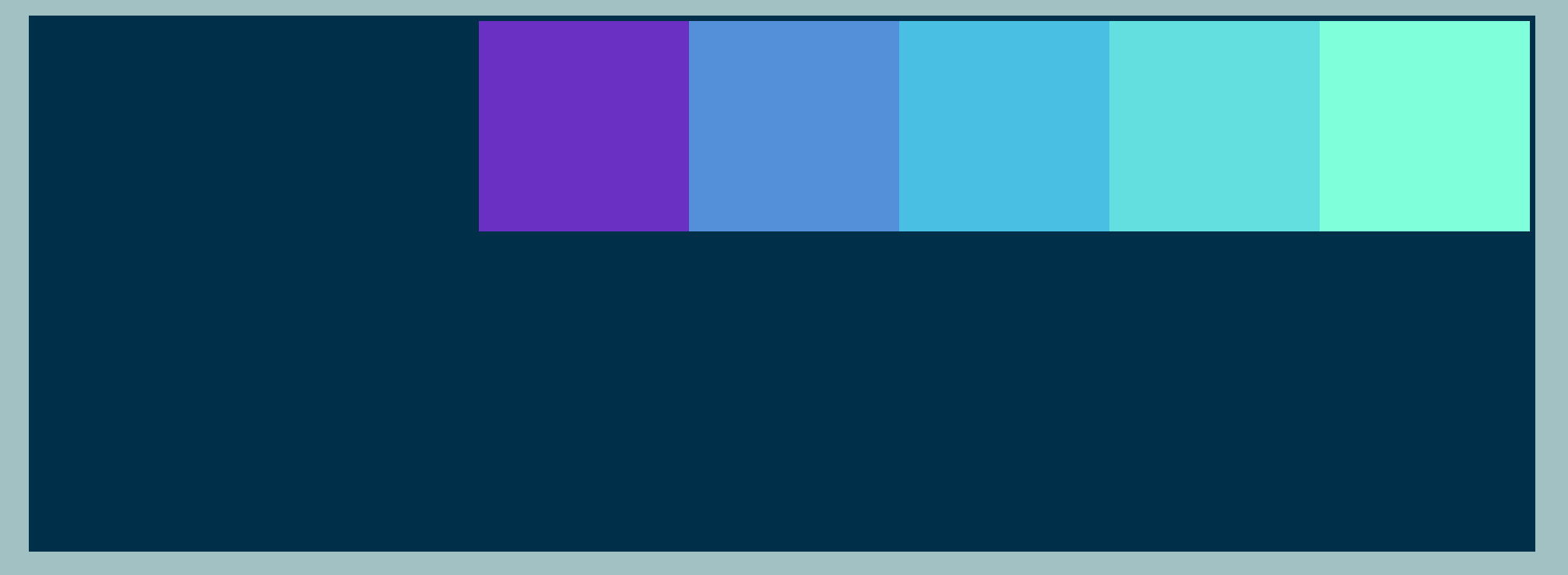
flex-direction: row-reverse; this sets our divs in reverse order along the main-axis #container { display: flex; flex-direction: row-reverse; /* change direction to a row from right to left */ }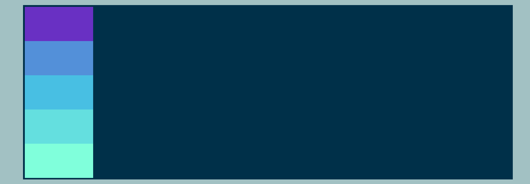
flex-direction: column-reverse; lays out things in a column from bottom to top #container { display: flex; flex-direction: column-reverse; /* change direction to a column from bottom to top */ }
justify-content
The Flexbox property justify-content is used to align flex items along the main axis of a flex container. It can be set to flex-start, center, flex-end, space-between, space-around, or space-evenly.
The justify-content property is used to align flex items along the main axis of a flex container. Later, you'll see that a property called align-items, which is used to align items along the cross-axis. In either case, the main axis could be the horizontal (x-axis) or vertical (y-axis) axis: it depends on the flex-direction value!
Pros and cons of utilizing justify-content:
- Allows for easy alignment of flex items along the main axis of a flex container.
- Can be used to create visually pleasing and organized layouts.
- Can be used in combination with other Flexbox properties, such as align-items and align-content, to create more complex layouts.
- However, alignment options may be unsuitable for all types of layouts.
Justifying The Content
- With justify-content, the property combines with flex-direction to switch the position of elements within a container. The default value for this property looks like this: justify-content:flex-start;
- flex-start is the default. This dictates that the flex items are aligned to the start of the main axis within a flex container. This means that the items will be aligned to the left if the flex-direction is set to "row" or to the top if the flex-direction is set to column. justify-content:flex-start; means that the items will remain in the same direction as the main axis dictated by the flex-direction property.
- justify-content:center simply does centering of the content around the main
axis.
However, it's easiest to visualize how this works with the image below. Here, we will
demonstrate
how
justify-content:center
works alongside the various flex-direction properties. For simplicity, the
default
of
flex-direction:row; is used first, but look at the other possibilities for
combinining flex-direction with justify-content:center;
                            #container {
                                display: flex;
                                flex-direction: row;  /*This is variable!*/
                                justify-content: center;
                                }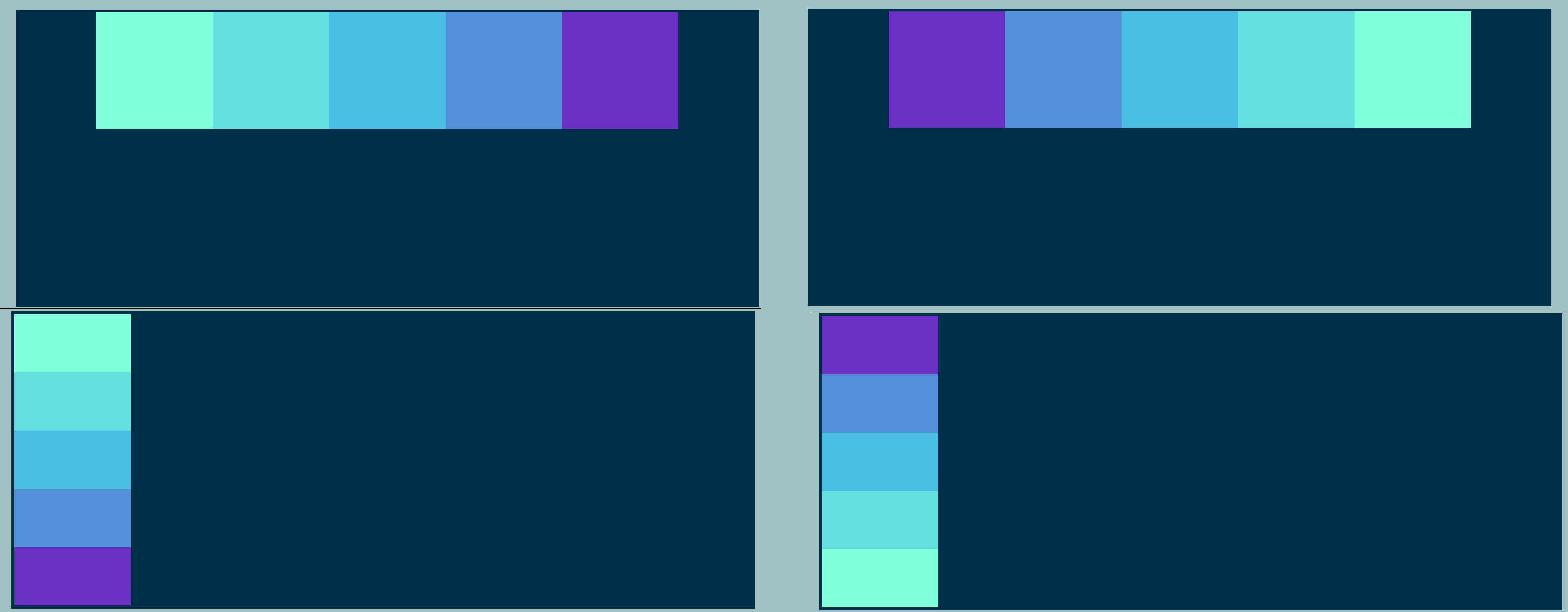
justify-content:center; (clockwise: flex-direction:row; flex-direction row-reverse; flex-direction:column; flex-direction:column-reverse; - flex-end will take the content, and move it to the end of the
main axis.
                            #container {
                                display: flex;
                                flex-direction: row;
                                justify-content:flex-end;
                                }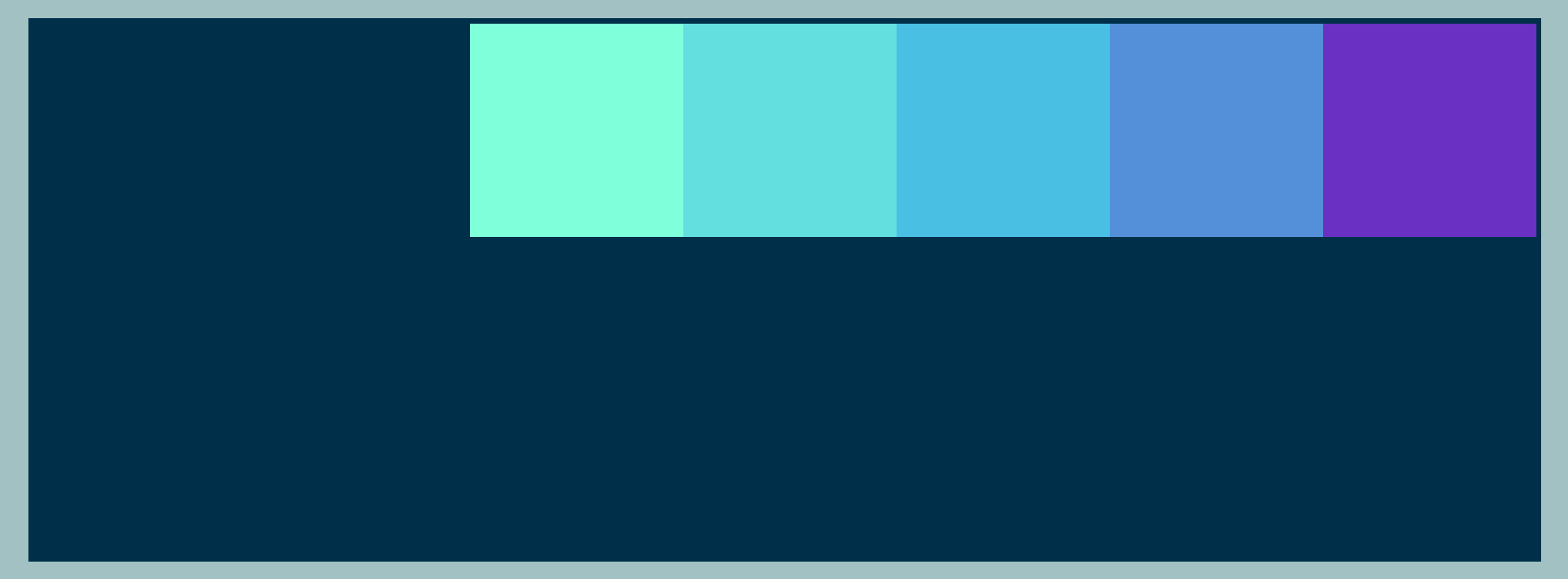
justify-content:flex-end; - space-between evenly distributes space between the elements.
If no
border is set,
the elements push themselves to the furthest points either side of the main axis.
                            #container {
                                display: flex;
                                flex-direction: row;
                                justify-content:space-between;
                                }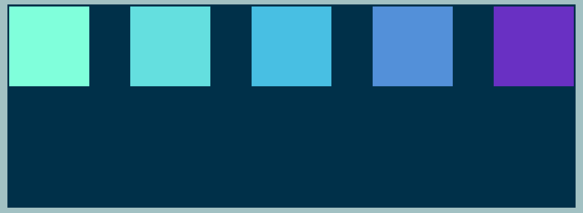
justify-content:space-between; - space-around gives even spacing around each element on the
main
axis, but usually gives a 'half-space' on the far ends of the axis, while the spaces between
elements is a 'full space'.
                            #container {
                                display: flex;
                                flex-direction: row;
                                justify-content:space-around;
                                }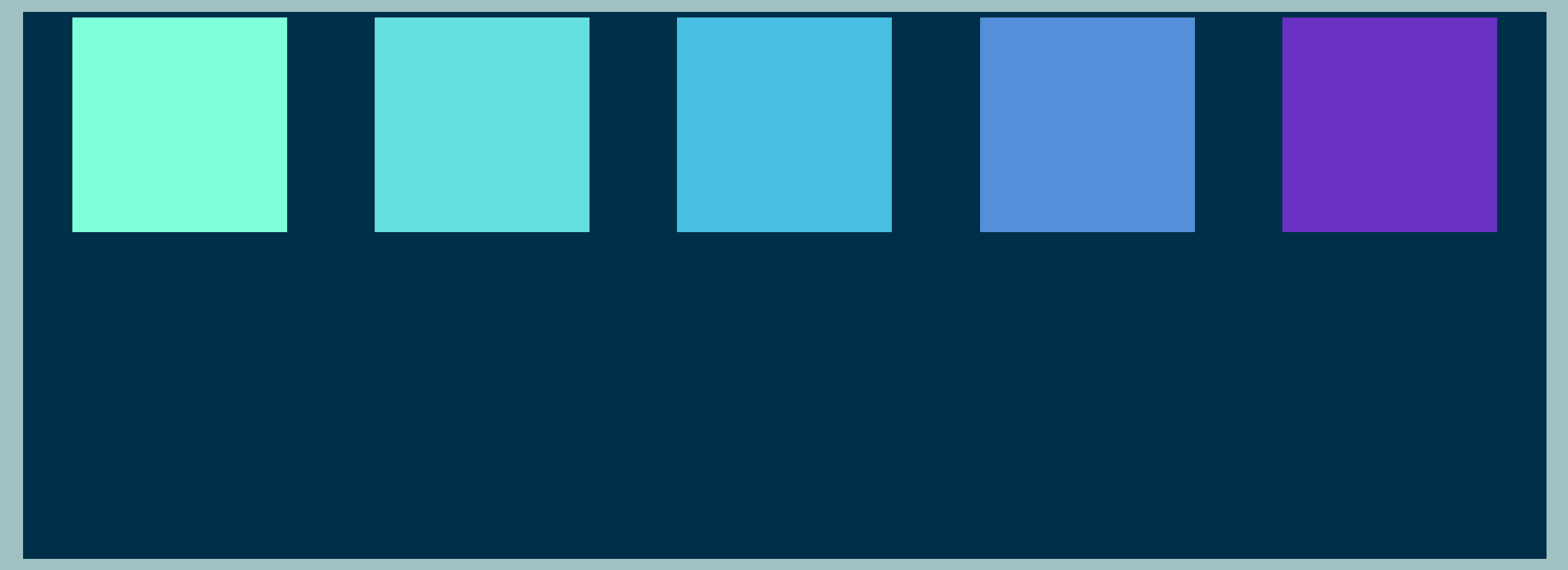
justify-content:space-around; - space-evenly basically puts space around each element on the main-axis, but
does so
in a way that means the space around each element in the container is perfectly equal!
                            #container {
                                display: flex;
                                flex-direction: row;
                                justify-content:space-evenly;
                                }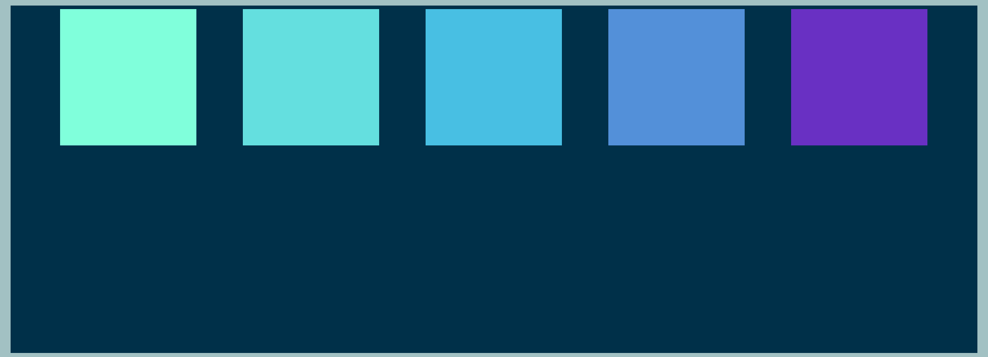
justify-content:space-evenly;
There are six values associated with justify-content:
On to the next part