Example 1
Example 2 (Demonstrating the effect of flex shorthand)
flex-basis, flex-grow, and flex-shrink
All of these properties are used to control the size and behavior of flexbox items. When used with other flexbox properties like flex-direction, align-items and justify-content, these properties can be used to create flexible and responsive layout.
- flex-basis sets the initial size of a flex item before any addition space (or shrinking) is distributed/applied. It can be set to a specific value (e.g. flex-basis:200px;) or a percentage of the available space (e.g. flex-basis:50%;
- flex-grow controls how much a flex item should grow relative to other flex items: i.e. flex-grow controls the amount of available space an element should take up. For example, if one flex item has a flex-grow value of 2 and another has a value of 1, the first item will take up twice as much space as the second. It'w usually a positive number that represents the proportion of available space, e.g. flex-grow:2;
- flex-shrink is deployed on items larger than the container - when there is not enough space in the container. This property controls how much a flex item should shrink relative to other flex items, and (as with flex-grow is a positive number that represents the proportion of available space that should be taken away from the item. For example, if one flex item has a flex-shrink value of 2 and another has a value of 1, the first item will shrink twice as much as the second.
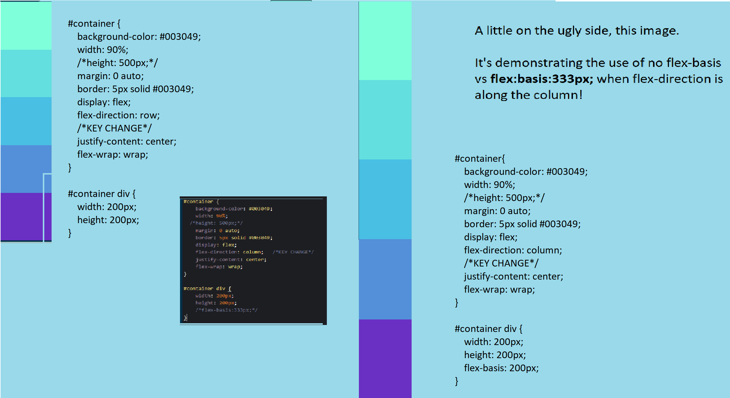
flex-basis
flex-basis:333px;
flex-basis:333px;
In this example, the flex-direction is in the column direction! Look at the different between no flex-basis and when a flex-basis of 333px; is applied!
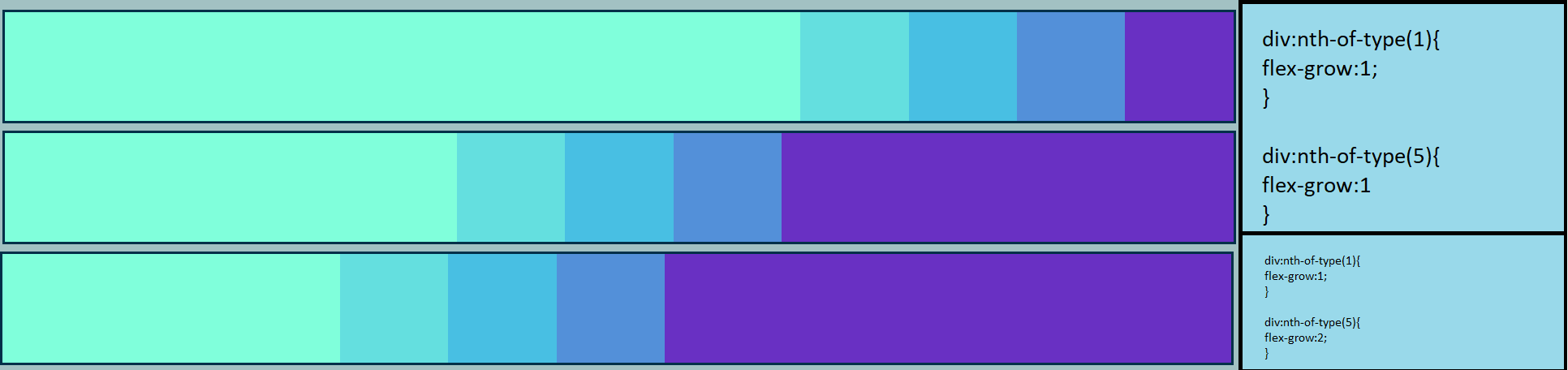
flex-grow
flex-grow:1;
                #container div {
                    width: 200px;
                    height: 200px;
                    flex-basis:200px;
                }

                div:nth-of-type(1){
                  flex-grow:1;
                }

                div:nth-of-type(5){
                    flex-grow:1;  (2nd image)
                    /*vs flex-grow:2; (3rd image)*/
                }
Notice how things scale and stack. These will be able to grow. To prevent over-growing, you can assign a
max-width too. In the 3rd image, we changed things slightly so that the growth of div 5 is twice that of
div
1. Notice how the elements can get so much larger when adjusting the size of the display!
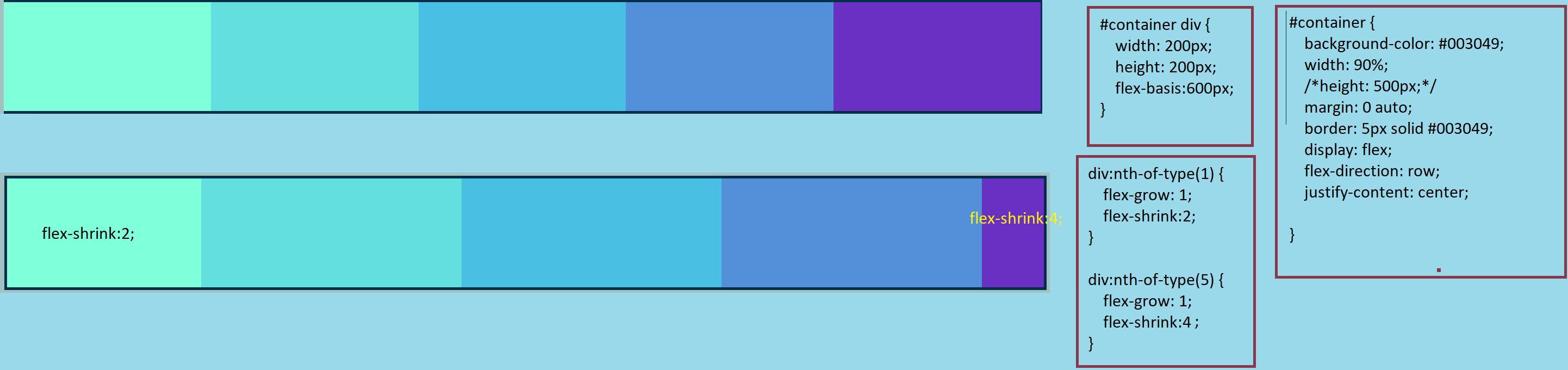
flex-shrink
flex-shrink:2;
This will make the affected div shrink by twice the usual shrink rate. flex-shrink:4; will affect the div's shrinkage by 4 times the rate. So div 1 will shrink twice as much as the middle 3 divs, while div 5 shrinks four times as fast!
Flex shorthand
flex-basis, flex-grow, and flex-shrink are used so frequently that special shorthand has been developed to help use them effectively.
- One value (unitless number) means flex-grow is being changed. e.g.flex:2;
- One value with units (e.g.flex:2; or flex:10em; or flex:30%;) means we are changing the width and height - thus, flex-basis is affected. Another common example is flex:min-content;. It tells the flex item to take up the minimum amount of space required to fit its content. This means that the item will shrink down to the size of its content, rather than using the value specified in the flex-basis property. For example, if a flex item has a flex-basis value of 200px and its content only takes up 150px, the item will take up 150px of space if flex-basis:min-content is used. This can be useful in situations where the content of the item is dynamic and may change in size, or when you want to ensure that the item only takes up as much space as it needs to. Keep in mind that when the flex-basis is set to min-content, the flex-item will only be shrinked to minimum size of its contents and if the contents is not big enough to fill the parent container the container may not be filled up and would leave some empty spaces.
- Two values, where both are unitless mean that the flex-grow and flex-shrink are being used. (e.g.flex:2 2;)
- Two values, where the latter has been given units means that the flex-grow and
flex-basis are changed. (e.g.flex:2 30px;) Here is a
brief
image-based summary so far:
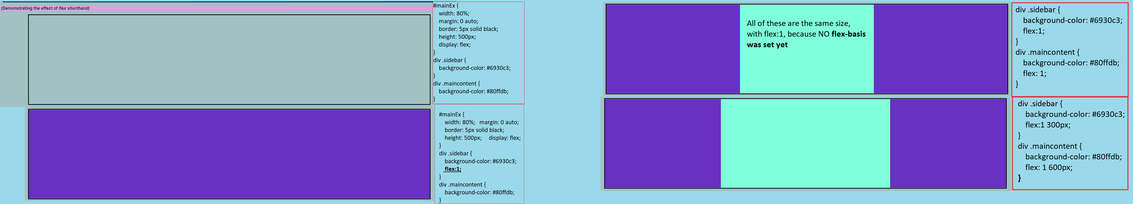
See how introducing flex at all changes everything! - Three values are used this order: flex-grow, then flex-shrink, then flex-basis. (e.g.flex:2 2 10%;)
- Finally, global values are sometimes used in the flex shorthand. They come in the form of flex:inherit;, flex:initial;, and flex:unset;
Move on to Media Queries