The flex-wrap property sets whether flex items are forced onto one line or can wrap onto
multiple lines. If wrapping is allowed, flex-wrap sets the direction in which lines are
stacked. It's also affected by the choices made in flex-direction and
justify-content. flex-wrap can also be used to change the direction of
the
cross-axis.
Pros and cons of utilizing flex-wrap:
Using flex-wrap prevents elements from becoming too wide or too tall for the
container.
By wrapping elements onto multiple lines with either the wrap or
wrap-reverse value, you can ensure that they all fit within the container's bounds
in
their original sizes.
Again, this property helps create more flexible and responsive layouts that are visually appealing:
wrapping elements can allow for a more dynamic layout that adapts to the size of the container or
the
viewport.
However, some browsers have issues with compatibility. This can be averted with a few
fallbacks in the head of the HTML.
In addition, flex-wrap can have a significant cost on performance, as it causes
additional
computation and layout work for the browser.
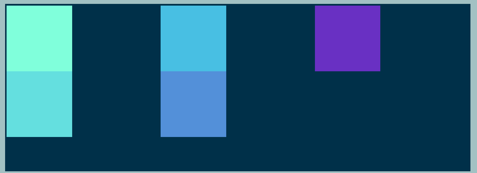
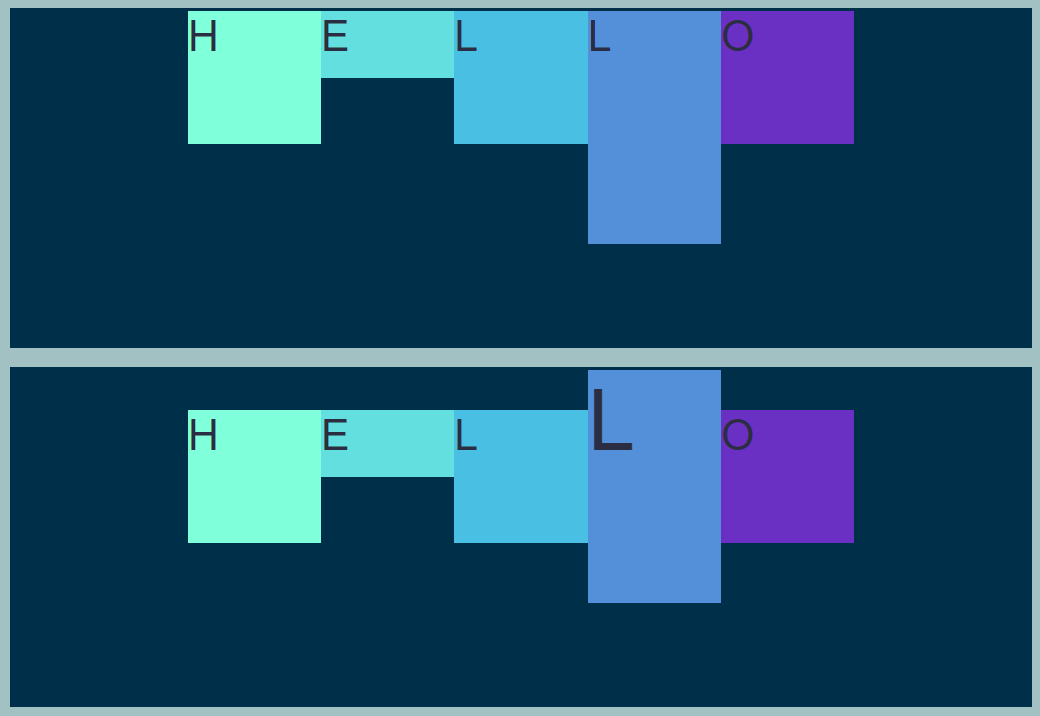
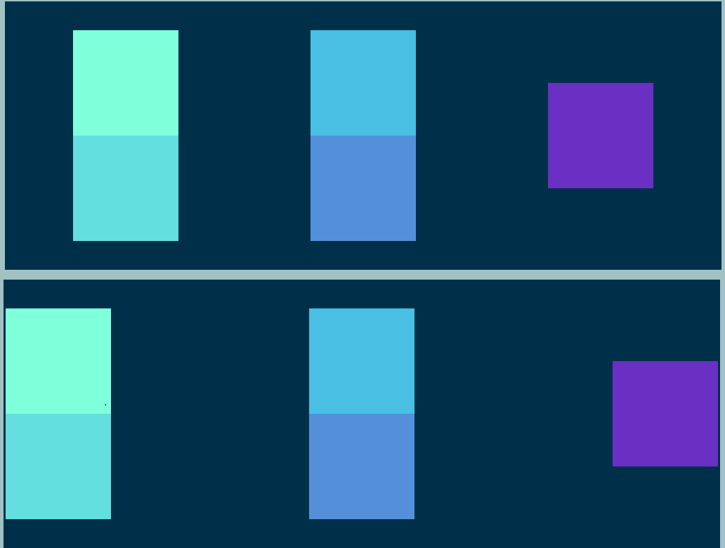
Key values associated with the flex-wrap property: a demo with flex-direction:column
There are three commonly accepted values used with flex-wrap, which are the default
valuenowrap, wrap, and wrap-reverse.
Obviously,
our 5 200px high divs DO NOT FIT inside a 500px container. Let's see what
flex-wrap and its values do with this:
nowrap is the default. With nowrap, the flex items will be laid
out in
a single line. In undersized
containers, these elements will shrink down to fit. Everything is aligned to the
top,
because our main
axis goes from top to bottom in this case.
                        #container {
                            display: flex;
                            flex-direction: column;  /*main axis is vertical*/
                            justify-content: flex-start;  /*main axis is top to bottom*/
                            flex-wrap:nowrap;  /*DEFAULT!*/
                            }
flex-wrap:nowrap;
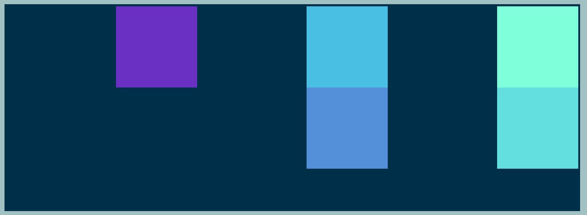
Changing this to flex-wrap:wrap gives a dramatic difference! With
wrap, the Flexbox properties break into
multiple lines.
Notice how flex-wrap is set, and that
justify-content
is space-evenly etc...
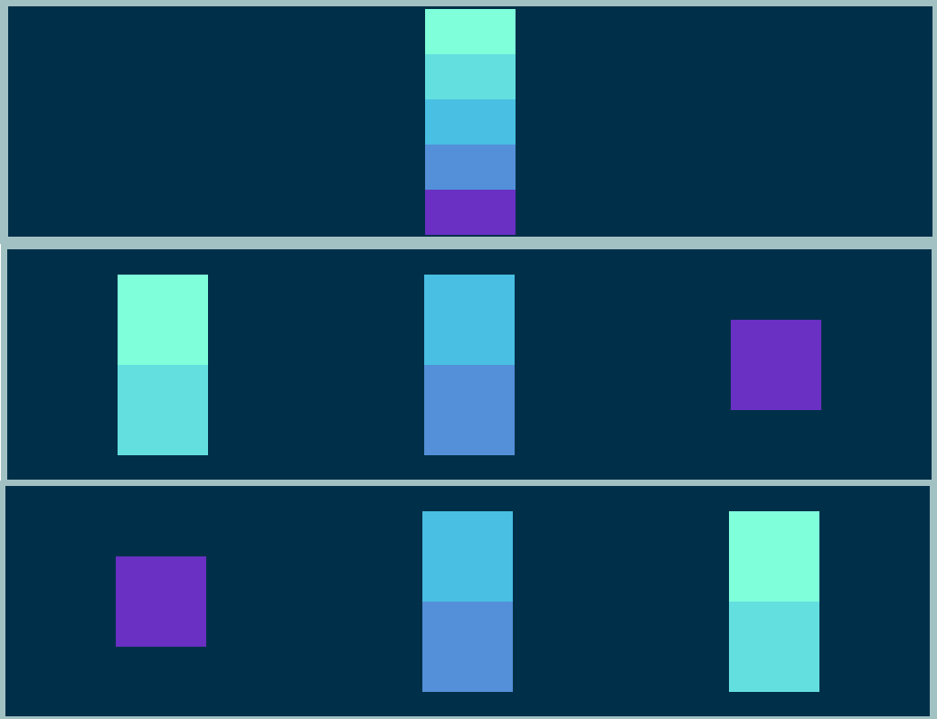
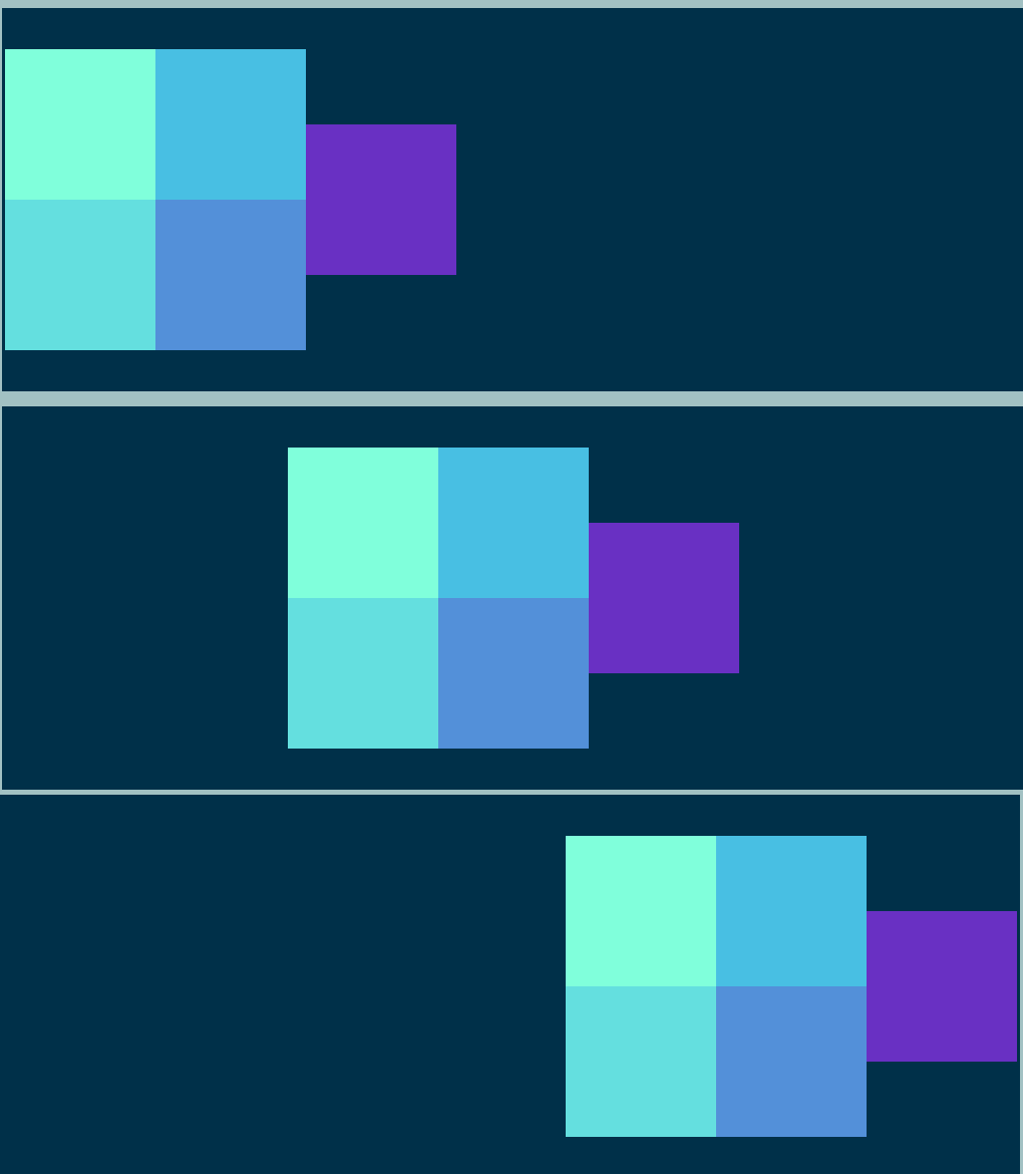
align-items
In Flexbox, the align-items property is used to align the items on the
cross-axis of a flex container. Note how it constrasts with
justify-content! justify-content aligns items along the main axis,
whereas
align-items aligns items along the cross axis! The
cross-axis is the axis perpendicular to the main axis, which is determined by the
flex-direction property.
Values of align-items
The align-items property takes several possible values, including:
stretch (default): Stretches the items to fill the container along the
cross
axis. In
non-flex items, the default is "normal".
align-items:flex-start; aligns the items to the start of the container along the
cross-axis. If flex-direction is row, and justify-content is
center,
we'll have an identical image to the one above!
flex-end aligns the items to the end of the container along the
cross
axis.
center aligns the items to the center of the container along the cross axis. One
really
key point to note is that if you want to center your items horizontally and
vertically,
you can set both justify-content and align-items to
center.
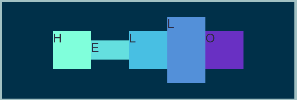
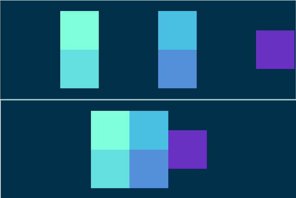
To really show the point, I did some (temporary) inline editing of the heights of two of the divs!
The
HELLO is included to help reinforce the next point too!
                        #container {
                            /*Some heights were changed to help show the effect*/
                            display: flex;
                            flex-direction: row;
                            justify-content: center;
                            align-items:center;
                            }
align-items:center;
baseline aligns the items to the baseline of the contents of container along the
cross-axis. So,
the baseline of the text HELLO will be aligned! In the former example, HELLO is aligned to the top
of
the container. However, in the 2nd image, not all of the contents are aligned to the top of the
container: rather, the contents are aligned around the word HELLO: i.e. the contents are aligned to
the
baseline!
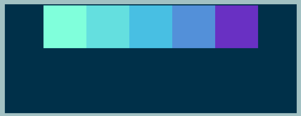
Flexing Example 1: changing flex-wrap (default/wrap/wrap-reverse)
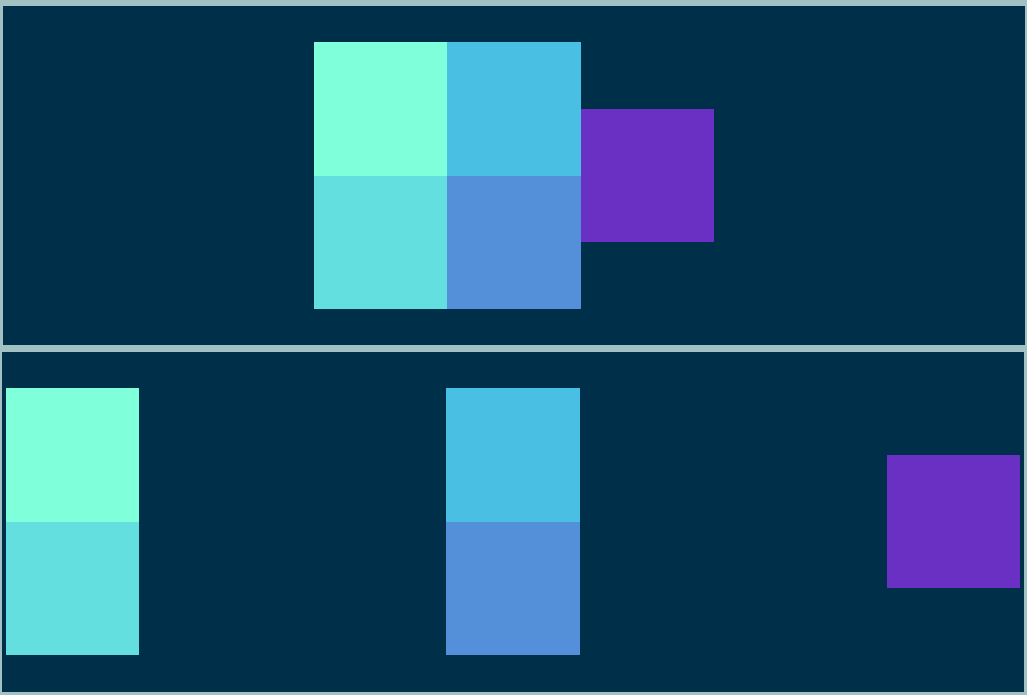
align-content
The align-content property in Flexbox is used to align the items on a flex container's
cross-axis. It can be
used to distribute space between rows or columns of flex items. This can be useful for creating evenly
spaced grids of items, or for aligning items to the start or end of a container. The TLDR: it aligns a
flex
container's
lines within the flex container when there is extra space in the cross-axis.
align-content is similar to justify-content, but works on the cross-axis(rows) rather than the
main-axis(columns)
Finally, if neither wrap nor wrap-reverse are being used, then this
property is meaningless!
The benefits of align-content
Allows for precise alignment of lines within a flex container.
Can be used to distribute space between lines evenly.
stretch (default value): with this, lines stretch to take up the remaining space.
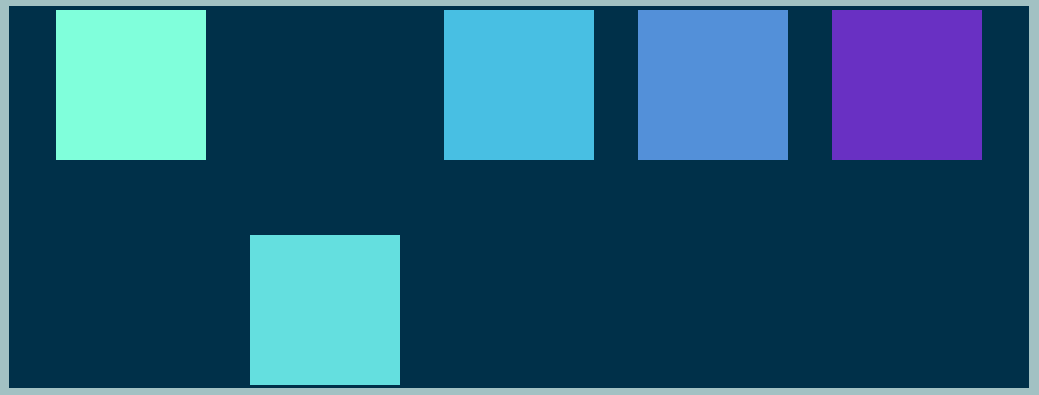
Whereas align-content is used to align the lines within a flex container along the
cross-axis,
align-self is used to align individual items along the cross-axis within a flex
container.
flex-end: lines are positioned at the end of the flex container. It allows you to align
a
single item, and can have an effect on each element individually. I'll briefly demonstrate this on the
2nd
child div in the container