Media Queries
A media query is CSS is used to apply different styles to a webpage depending on particular parameters, such as screen width or device type. Most commonly are the screen size, but also portrait vs landscape, and one of the most common examples is to collapse a nav-bar so that it doesn't take up too much space!
                @media (max-width:800px){
                    .sidebar{
                        display:none;
                    }
                    .main{
                        width:80%;
                    }
                }

                @media (min-width:30em) and (orientation:landscape){
                    #container{
                        flex-direction:column;
                        justify-content:center;
                    }
                }
Some common standard resolutions to consider when building your site:
- 320px — 480px: Mobile devices.
- 481px — 768px: iPads, Tablets.
- 769px — 1024px: Small screens, laptops.
- 1025px — 1200px: Desktops, large screens.
- 1201px and more — Extra large screens, TV.
General Advice on Media Queries
To make the website responsive across a range of screens using HTML and CSS provided, you can take the following steps:
- Ensure there's a viewport <meta> tag in the head of your HTML document. This tells the browser how to adjust the dimensions of the page to fit each device's screen. Each of my pages already included one of these: <meta name="viewport" content="width=device-width, initial-scale=1.0"gt;
- Use CSS media queries to apply different styles to different screen sizes. Media queries allow you to apply specific CSS styles based on the characteristics of the device, such as its screen size or resolution.
- Use CSS Flexbox and Grid layout to create flexible and responsive layouts. Flexbox and Grid make it easy to create layouts that can adapt to different screen sizes and orientations, allowing you to create designs that look good on both small and large screens.
- Use relative units for sizes, such as em, rem, vw, and vh, instead of absolute units like px . This will allow your website to adjust to different screen sizes.
- Consider using a CSS framework like Bootstrap or Foundation that already have built-in responsive design features. This can save you time and effort in creating a responsive design from scratch.
- Test your website on different devices and screen sizes, and make any necessary adjustments to the CSS code to ensure that it looks and works as expected.
- Optimize images to reduce their size, this will help your website load faster on mobile devices.
Media Query Example
Please look at the following image, which uses the HTML code shown:
                <body>
                    <nav>
                        <a href="#home">Home</a>
                        <ul>

                            <li>
                                <a href="#Home">Learn More</a>
                            </li>
                            <li>
                                <a href="#Home">About</a>
                            </li>
                            <li>
                                <a href="#Home">Contact</a>
                            </li>

                        </ul>
                        <a href="#signup">Sign Up</a>
                    </nav>
                    <h1>Media Queries</h1>

                </body>
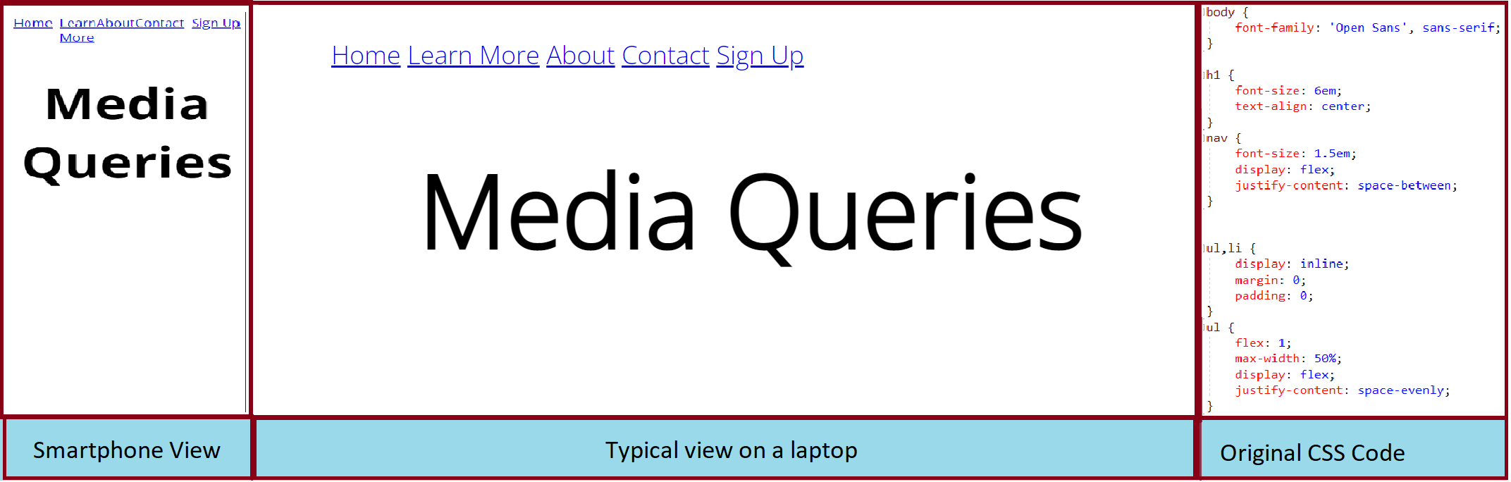
We want to try and adjust this so that it looks good on both smartphone and laptop!
We must use a media query to achieve this! For a smartphone, which current discourse in the community dictate has a maximum width of 480px, we can ensure that our CSS layout obeys it using:
                @media (max-width:480px){
                    color:purple;
                }
We want to try and adjust this so that it looks good on both smartphone and laptop!
                @media (max-width:480px) {
                    h1 {
                        color: purple;
                    }
                }
                @media (min-width:481px) and (max-width:768px) {
                    h1 {
                        color: orange;
                    }
                }
                @media(min-width:768px) {
                    h1 {
                        color: red;
                    }
                }
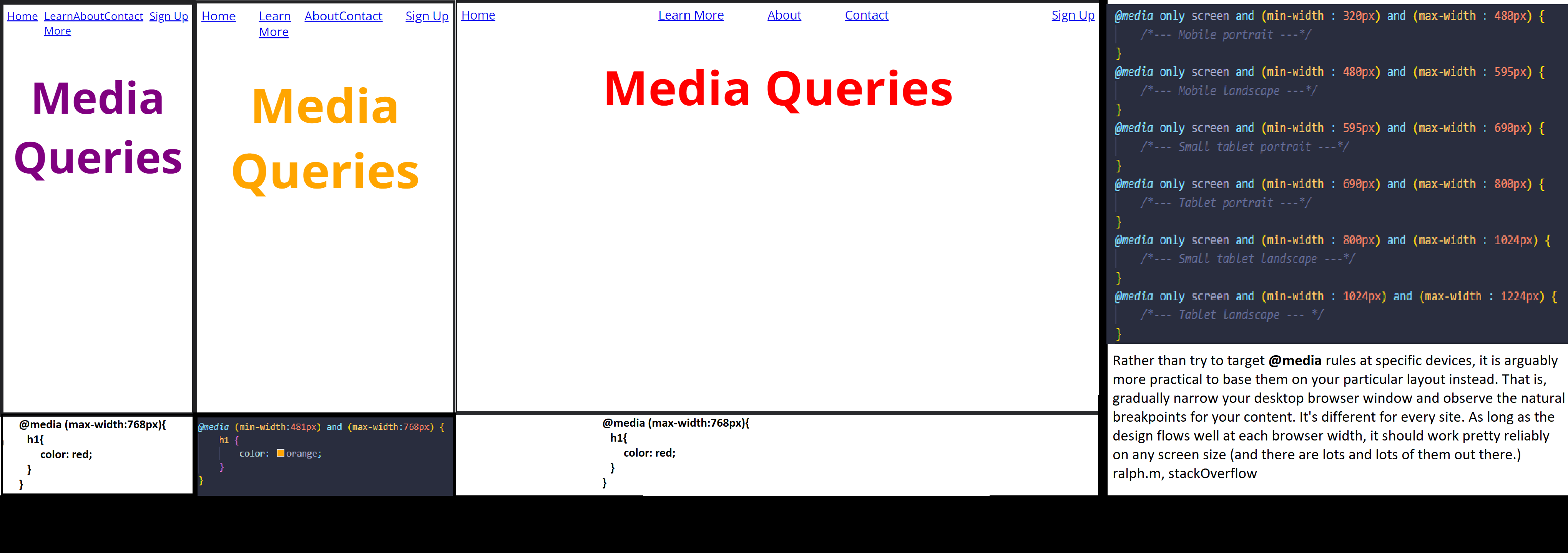
We must use a media query to achieve this! Play around with resizing the page here
Move on to the navigation bar project page