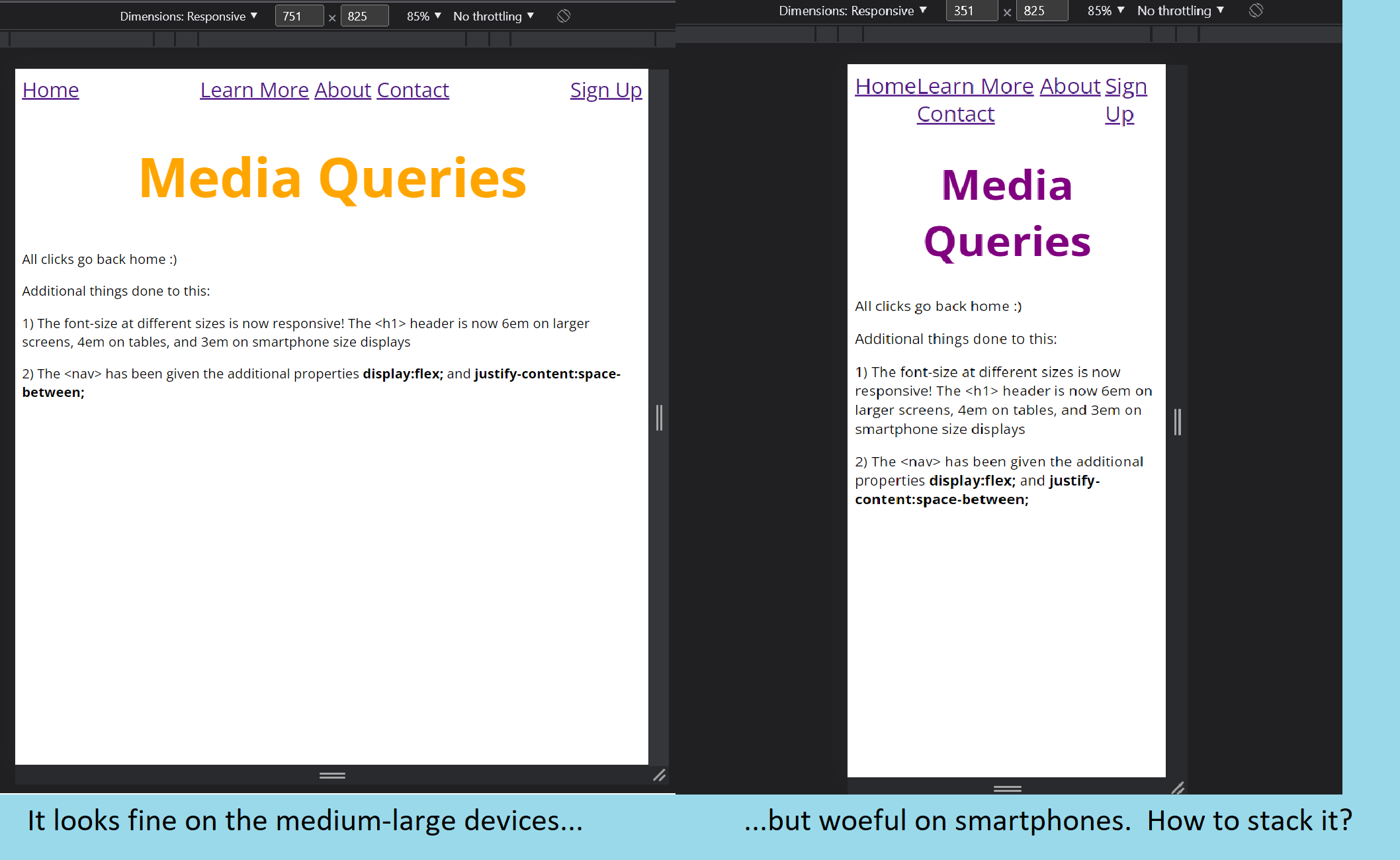
Media Queries
All clicks go back home :)
Additional things done to this:
1) The font-size at different sizes is now responsive! The <h1> header is now 6em on larger screens, 4em on tables, and 3em on smartphone size displays
2) The <nav> has been given the additional properties display:flex; and
justify-content:space-between;
3) You should realize that the <nav> element consists of an unordered list <ul> with 3 elements <li> inside it, plus two other <a> elements linking to "Home" and "Sign Up". We can change the way these <li> elements stack like so:
                ul{
                    border:1px solid red;
                    flex:1;
                    max-width:50%;
                    display:flex;
                    justify-content:space-evenly;
                }
One thing that was crucial for me was to place this code BELOW the ul,li{...} in the CSS file. If I hadn't the display would have been set to inline again.
4) Now, to deal with the untidy border. We only need to do this for smartphones, so within the media query for displays of less than 480px, I have included some extra code:
                @media (max-width:480px) {
                    h1 {
                        color: purple;
                        font-size: 3em;
                    }

                    nav {
                        flex-direction: column;
                    }

                    nav ul {
                        flex-direction: column;
                    }
                }
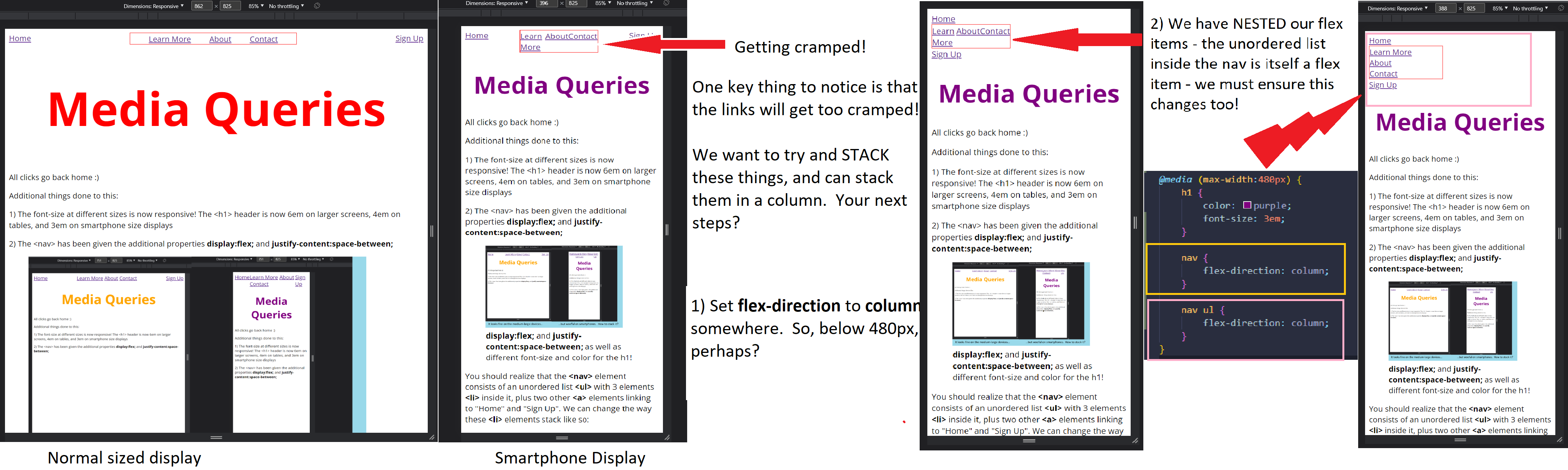
Finally, we have: